‘Every body that has soul in it must, as we have said, be capable of touch’. It was Aristotle’s further contention in the De Anima that touch is the only sense that a conscious creature must have in order to be. The other senses, said the Stagirite, namely sight, hearing, taste and smell, are necessary ‘not for being but for well-being’. Contemporary painting finds itself in agreement with these priorities in making perception a specialised version of touch, and touch the foundation for what is seen.
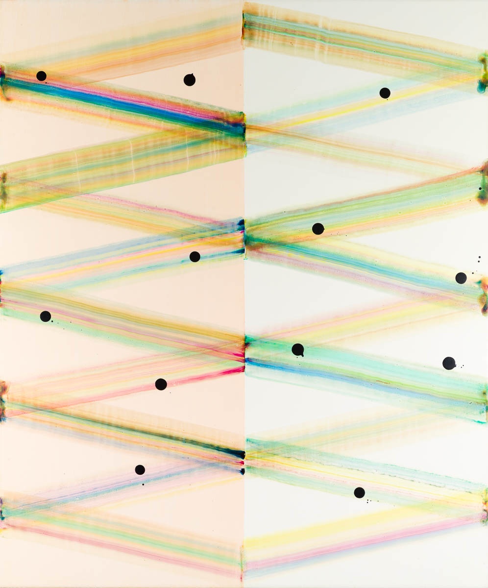
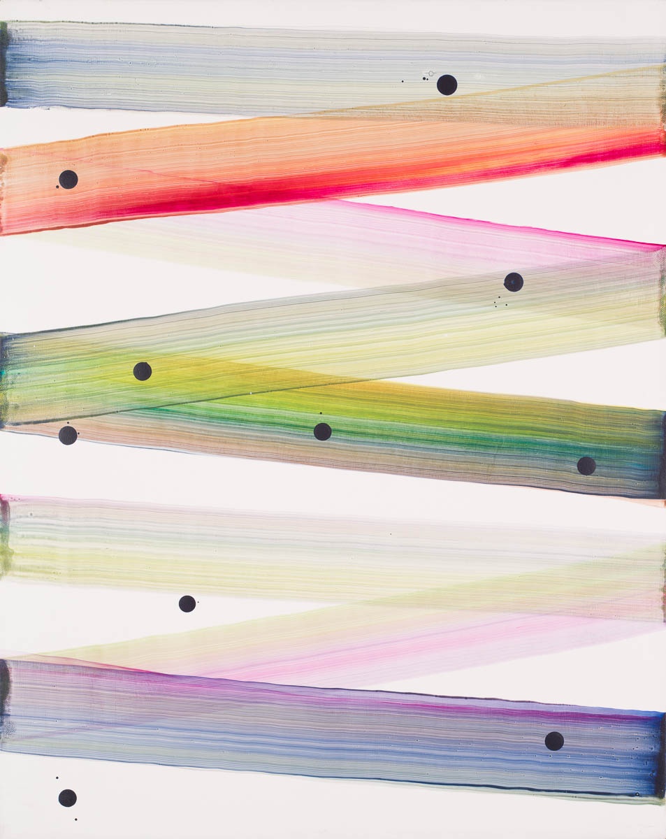
To look at Julian Brown’s new paintings, one gets an idea of what he means in calling some of them ‘manicured’. They are fastidiously presented; but that is not the only quality you see in the high-colour striations that Serso, for example, is an instance of. There is no intelligent regard for such works that does not ask questions about the calculations that gave rise to them. How wide does a swathe of colour have to be to fit a given number of them into the given format? Is that pulled swathe at just the right angle of decline, and is it likely to smudge the one just completed, or be smudged by the one to come? Would it matter if it were? What sort of surface must one prepare, to maximise the chances for that kind ofspeed-painting to succeed – casually, so it would seem, yet with assurance that the trick won’t go wrong. How much risk needs preserving in the painting process for mathematics not to completely sanitise it? The answer lies in mastery of the manufacture, the touch of the implement upon the ground. Yet Brown is not always a manicurist.
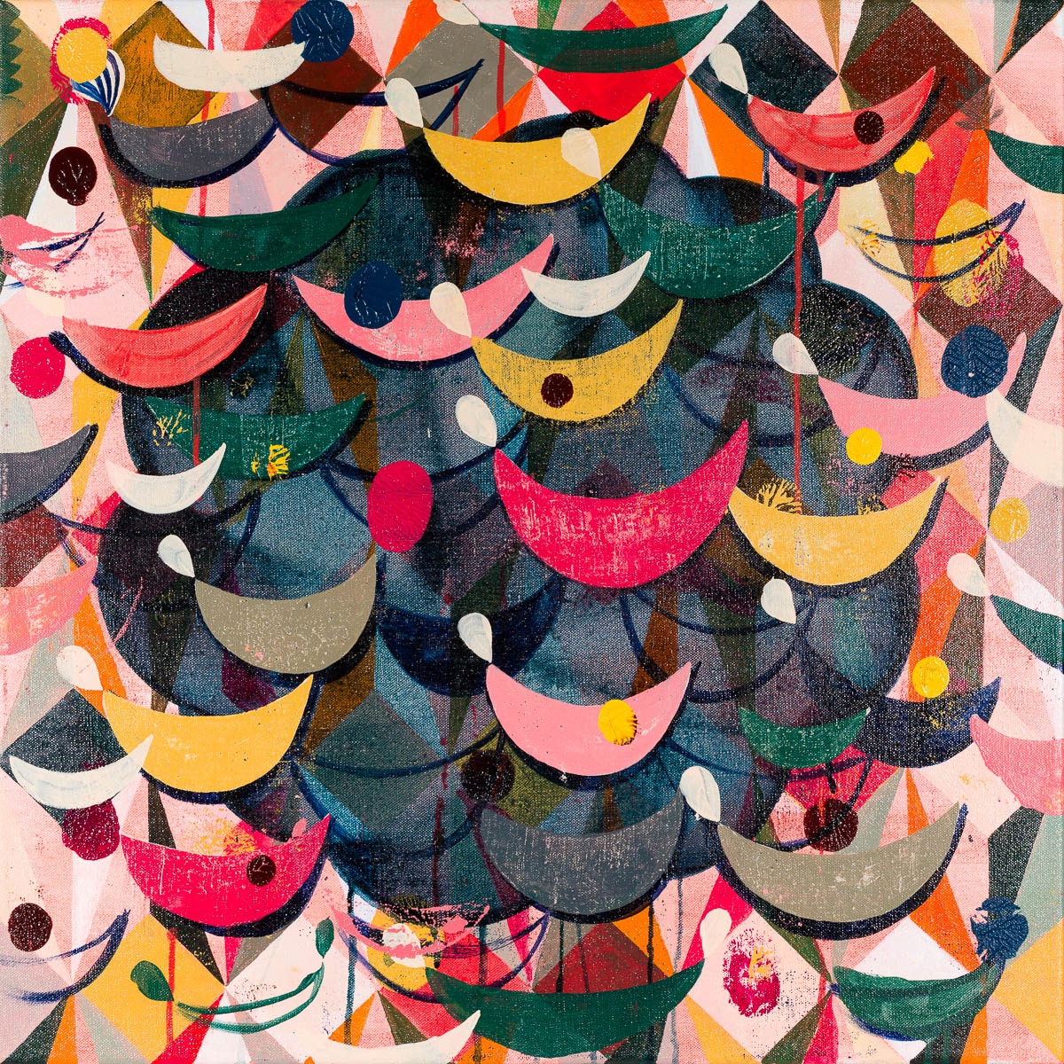
Paintings are flat objects, obviously; and in modern painting that flatness can be literal, but ludic too, a game of look-and-see with the materials and manners in the painter’s tool-kit. In the larger, more celebratory works, of which Luna Park or Black Lagoon in the present show are fine examples, the ludic attitude is slightly different, with the ‘quick’ surfaces of the small paintings largely absent. In the larger works, the artist will get things started with a pale-coloured diamond grid (the colours of cheap wrapping paper, roughly) then do something to it: interrupt it, obliterate the grid’s order, switch quickly from wide-angle to narrow, from field to focus. From there on it’s a matter of dialogue between a grid that shows signs of disappearing and various new visual strangers arriving on the block. He will put an arbitrary blob centrally, often dark green or blue, then smooth it out thinly. He might then overlay that double-surface with some signature boat-shapes or some fairground baubles, the latter sometimes painted on carefully and sometimes blotted on with the help of a transparent perspex screen. Some boat-shapes are painted, some are printed in the same monoprint method, pressing a painted shape onto the surface and hence reversing it, in a slightly hit-and-miss frame of mind. There are echoes in all this, remote and now quite formulaic, of a Polish paper cut-out tradition thatstill thrives in that country and in Ukraine.
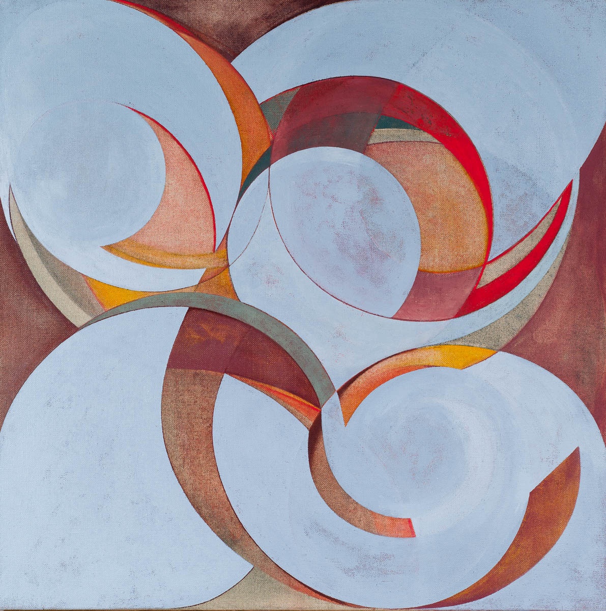
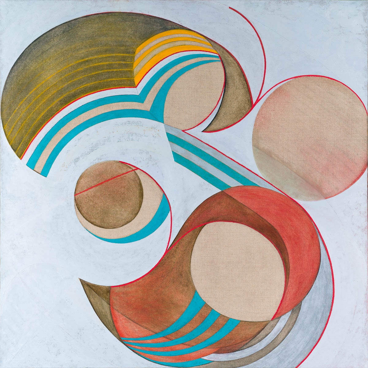
Celia Cook is an artist with an interest in geometry, but not of the regular kind. For one thing, she draws all her lines freehand. In the case of the paintings, the lines are made – not really drawn – with a loaded paintbrush traversing the interval from one point to another, usually by an indirect route. We notice that many of those lines are interrupted through intuitive revision, veiled by others, amalgamated in full view. In Rhanjo and Yodeleaux she starts with a square canvas and marks it by hand exploratively, resulting in nearly parabolic shapes swirling and colliding with others in an improvised but nonetheless carefully controlled relation to the painting’s framing edges. The latter relationship is especially important, for it makes of the picture-surface a container as well as a platform for the energies that unfold inside it. At the same time, we know it is impossible for a painter to associate two curved or curving forms together without them seeming to float, and probably revolve, relative to each other. In that case we are already seeingin the paintings an iconography of motion, a world of revolutions, intersections, coalescences, imbalances and adjustments in which each quasi-form vies with some other, or with several simultaneously. The terminology of biology is never far away; nor that of swirling natural forces at several different levels of scale. I think that Cook’s work probably comes from a moment, that of the later 1930s, in which the newest terminology was that of ‘concretion’, meaning the actual, the self-sufficient, and the real: orderings of form and order that come from material alone and in asense are destined to remain anchored there. Firm, emphatic shaping and forming was the manner being tried out by Auguste Herbin and Jean Hélion in their work of that decade. In Cook’s production, what she calls ‘concretion’ is to be found inthe ordering and re-ordering, the drawing and re-drawing, that her elaborate and complex paintings enact. Some formative work is under way in them; in time, but also in surface touch. Her tumbling, painted forms might appear to seek a state of balance but never quite achieve it, or never appear to; never result in what she calls ‘a state of rest’.
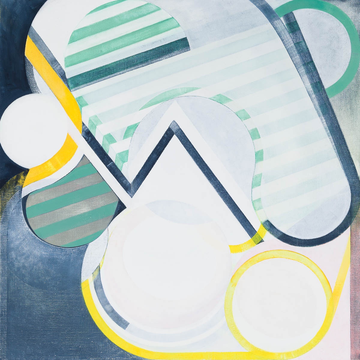
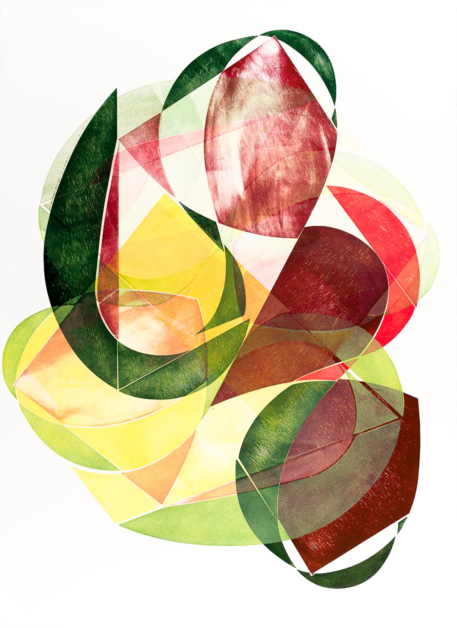
Then, in recent years, a discovery: that similar ends could be achieved by wood-block printing, a quicker and more hazardous process along the same path. Clan Concrete 7 is an example of the new procedure. Take a wooden sheet and mark it with those parabolic shapes and some straight ones, then cut it jigsaw-style into constituent blocks, from which three-or four colour printing on paper can begin.
In each unique print of the now completed Clan series, four or five impressions on the paper are made successively, the paper being lifted after each printing and some blocks subtracted from, or replaced into, the place they occupied before the whole pattern is rotated slightly in anticipation of the next printing. Apropos of ‘concretion’, it should be said that no curved form, or forms grouped together dynamically in the finished print, can ever be quite dissociated from the suggestion of head, shoulder, hip or rounded knee. Picasso taught modern artists that lesson in his own way. Human perception is always ready – too ready, no doubt – to find its human ‘other’ in forms and formations that are given to us to see. No measure of ‘concretion’ can ever entirely evade it.
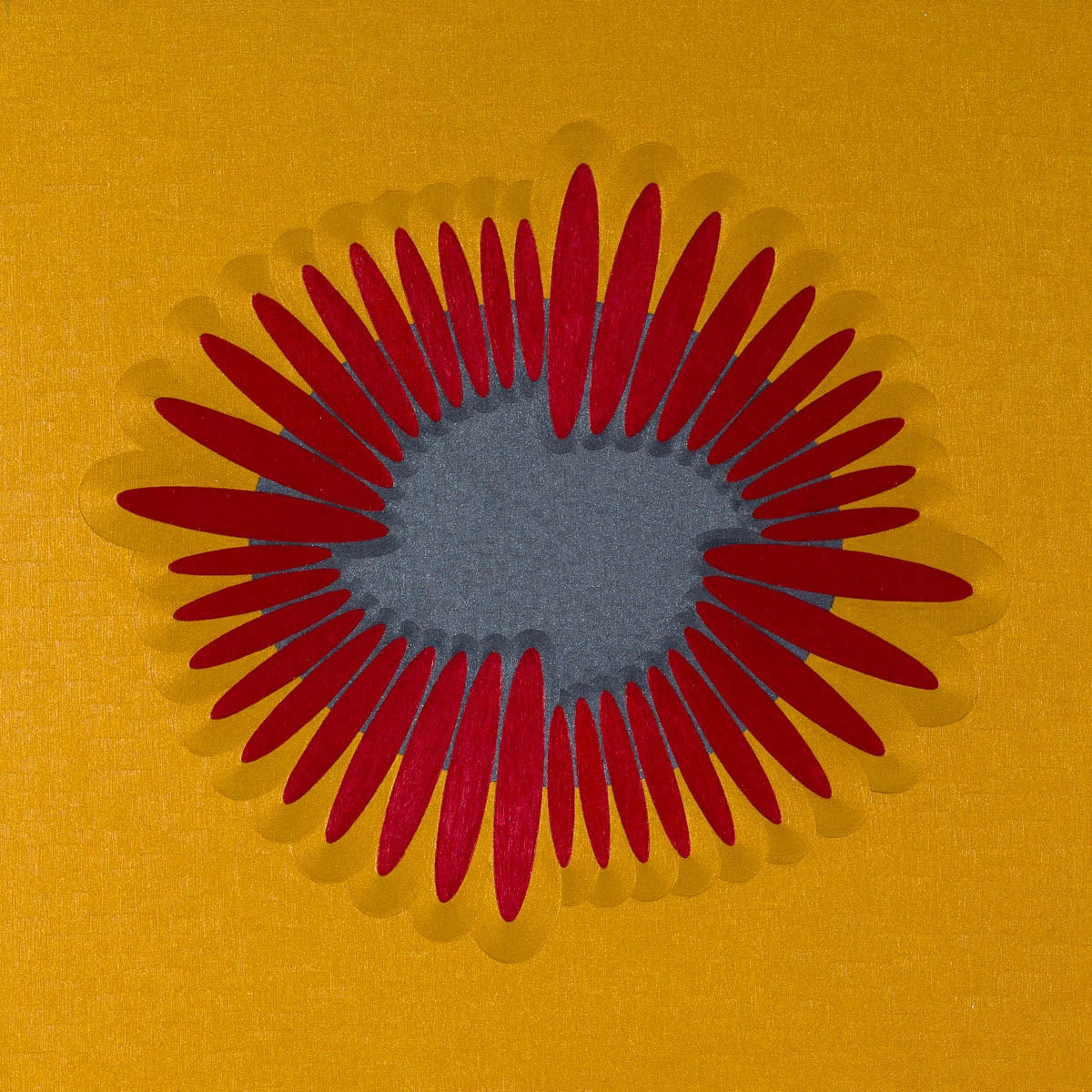
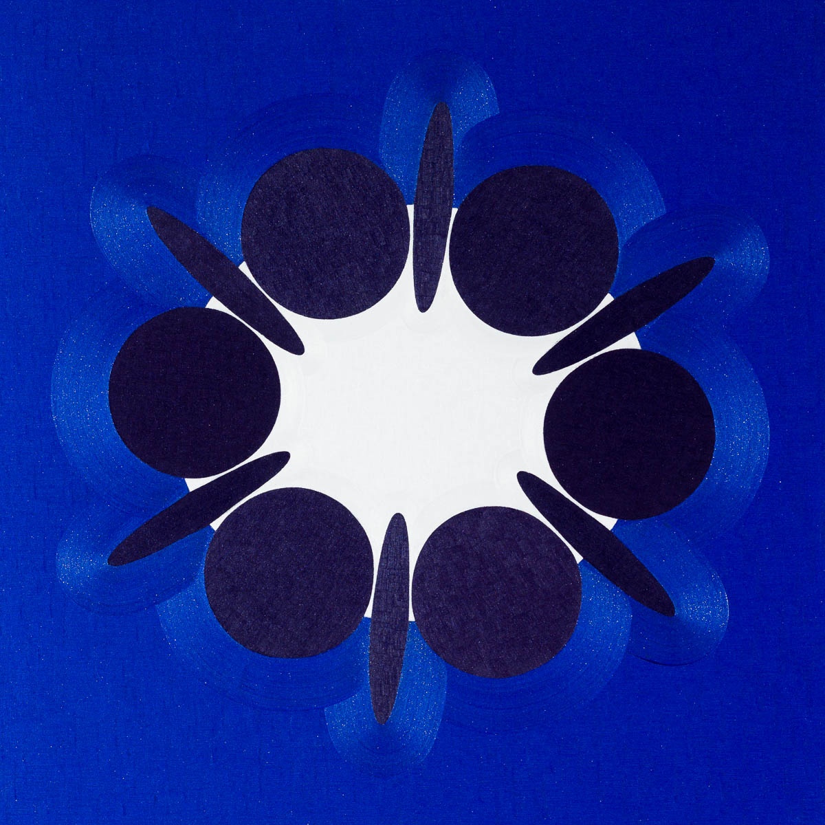
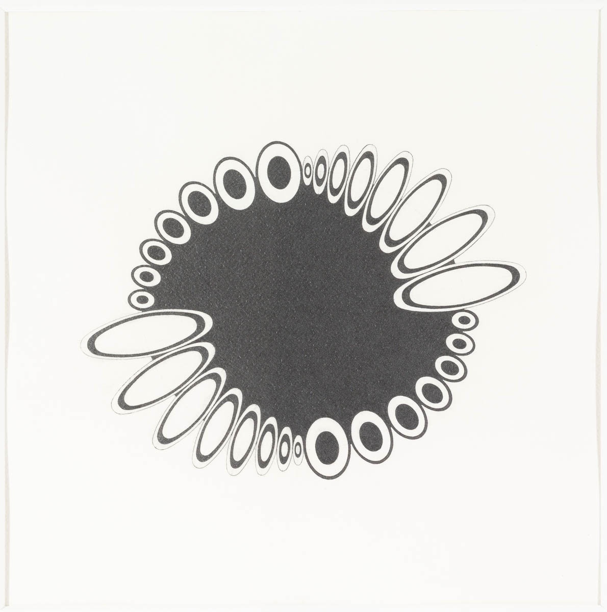
Harris’s beautiful water-colour and pencil drawings rehearse those complexities differently. Ellipses whose outlines intersect, in pairs, in foursomes or in stacks, create double-spaces that can be full or empty, like waves on a pond that overlap and disturb one another, or light-diffractions that cancel and multiply at the same time. These delicate works mimic those phenomena in their own way. Harris knows how self-patterning works, and constructs the drawings accordingly, a touch ironically, a touch playfully too. If some spaces are empty, others are filled with evenly applied pencil strokes, as if somewhere a maximum, even density was required. Meanwhile, inside the water-coloured forms the paint is applied unevenly, with the consequence that the settling of the paint cannot be surely predicted. Here alone in Harris’s production she allows herself to lose control, as the paint pigments ‘pool’ in depths of uneven and unpredicted intensity. In those cases, paradoxically, her virtuosity has allowed nature to come back in.

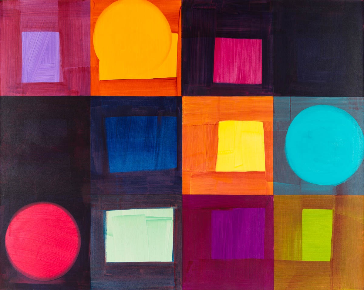
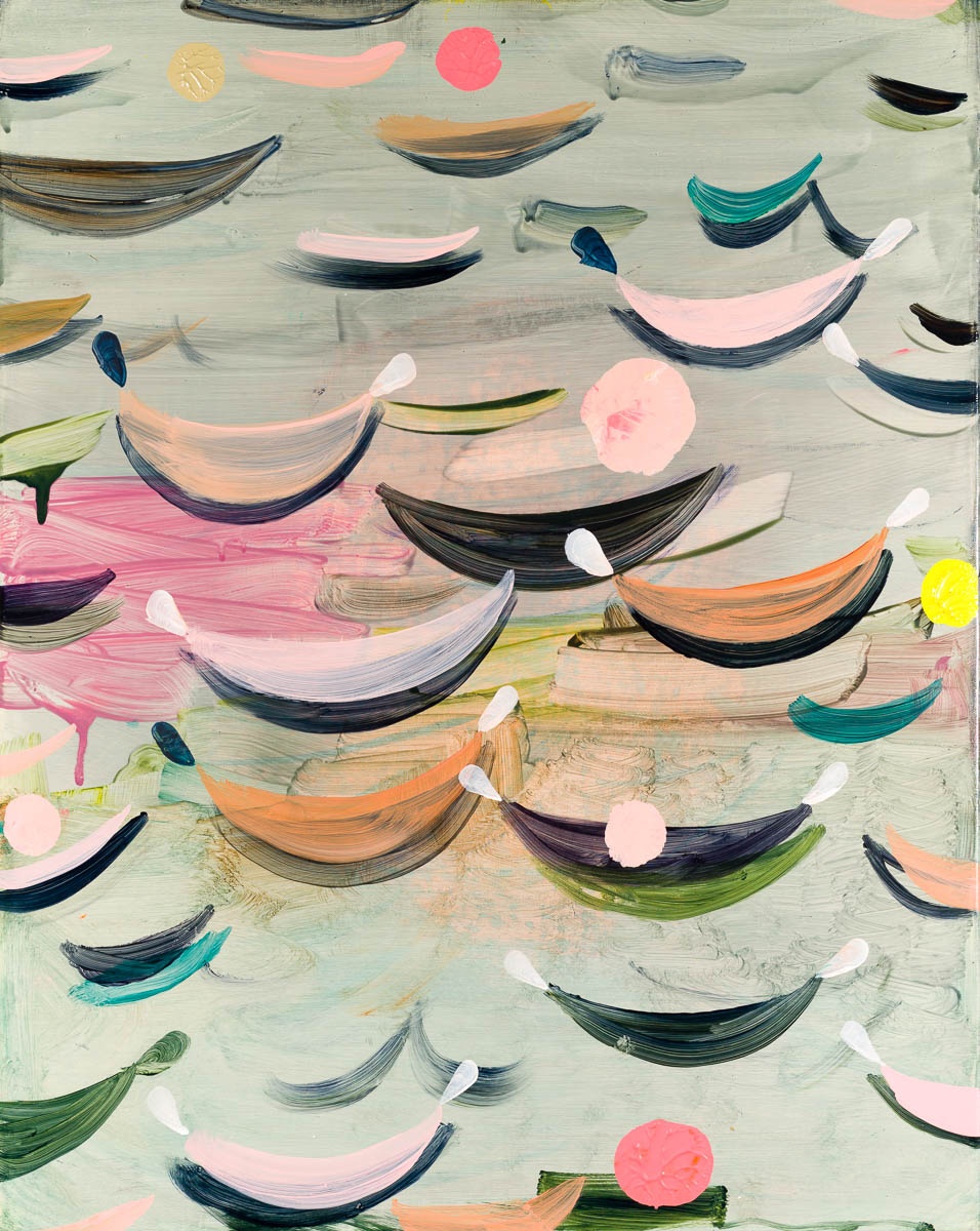
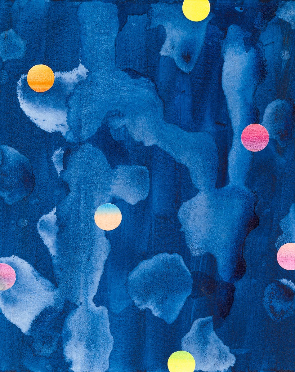
The recent series of paintings known as Wilbury, for instance, three of them featured here, exemplify those turns precisely. And there is something more. Fluid and solid, deep and shallow, light and dark: those paired qualities pulse and resonate in what may be a musical rhythm as much as a visual one. We know that art-music cross- overs are plentiful in modern painting. Paul Klee’s exercises in transparency showed how chromatic sequences can ‘sound’ like chords of colour, to which precedent Morris adds her own typical chords and tempos. The Travelling Wilburys was the name of the ad hoc band formed by Bob Dylan, Tom Petty, George Harrison, Roy Orbison and Jeff Lynne in the late 1980s (‘We’ll bury the errors’, Harrison is said to have said about their recording sessions), and the Wilbury Twist is a jive movement that we can try for ourselves. That bit of folklore is only part of the story, of course. It seems to me at least possible that Morris’s colour tonalities, her distinctive pale mauves and xanthic yellows, placed alongside water-borne greys and sea-greens, at some level echo those of Albert Marquet, the still under-rated Fauve painter whom she admires for the limpid-mobile surfaces that he crafted for most of his career.
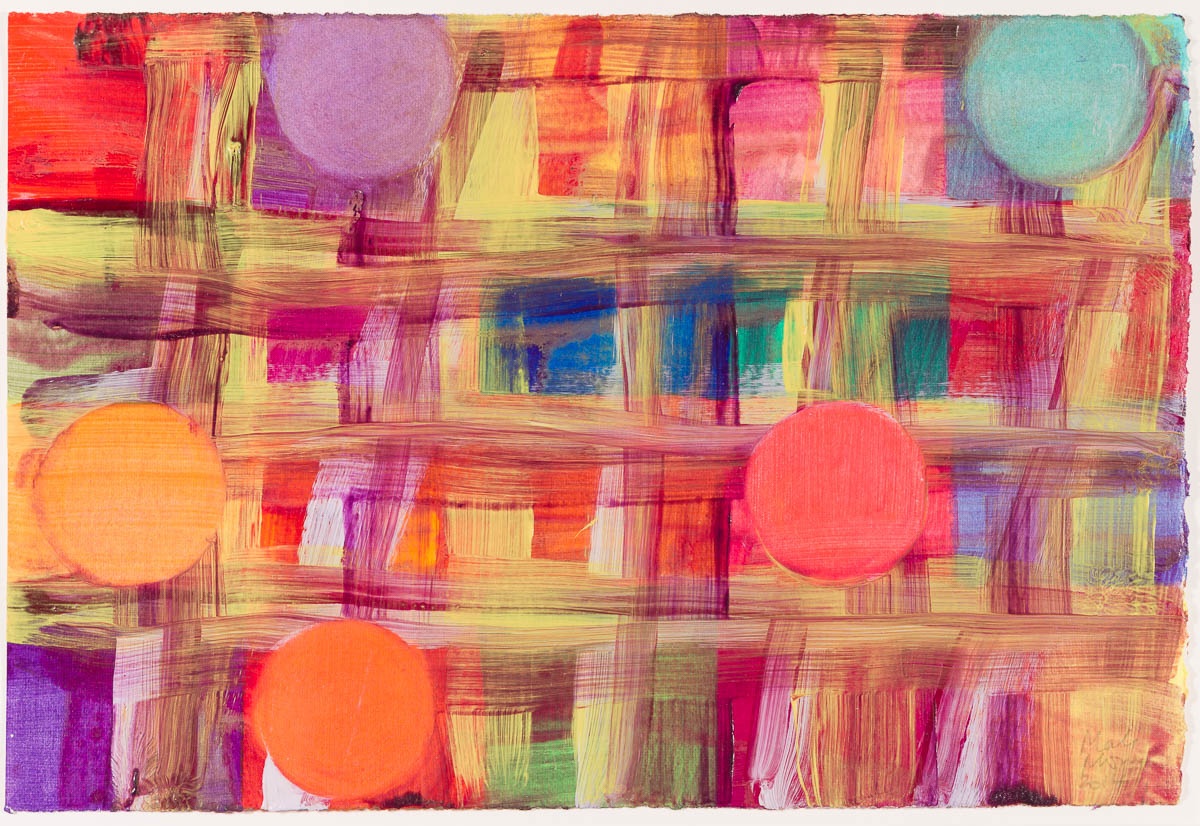
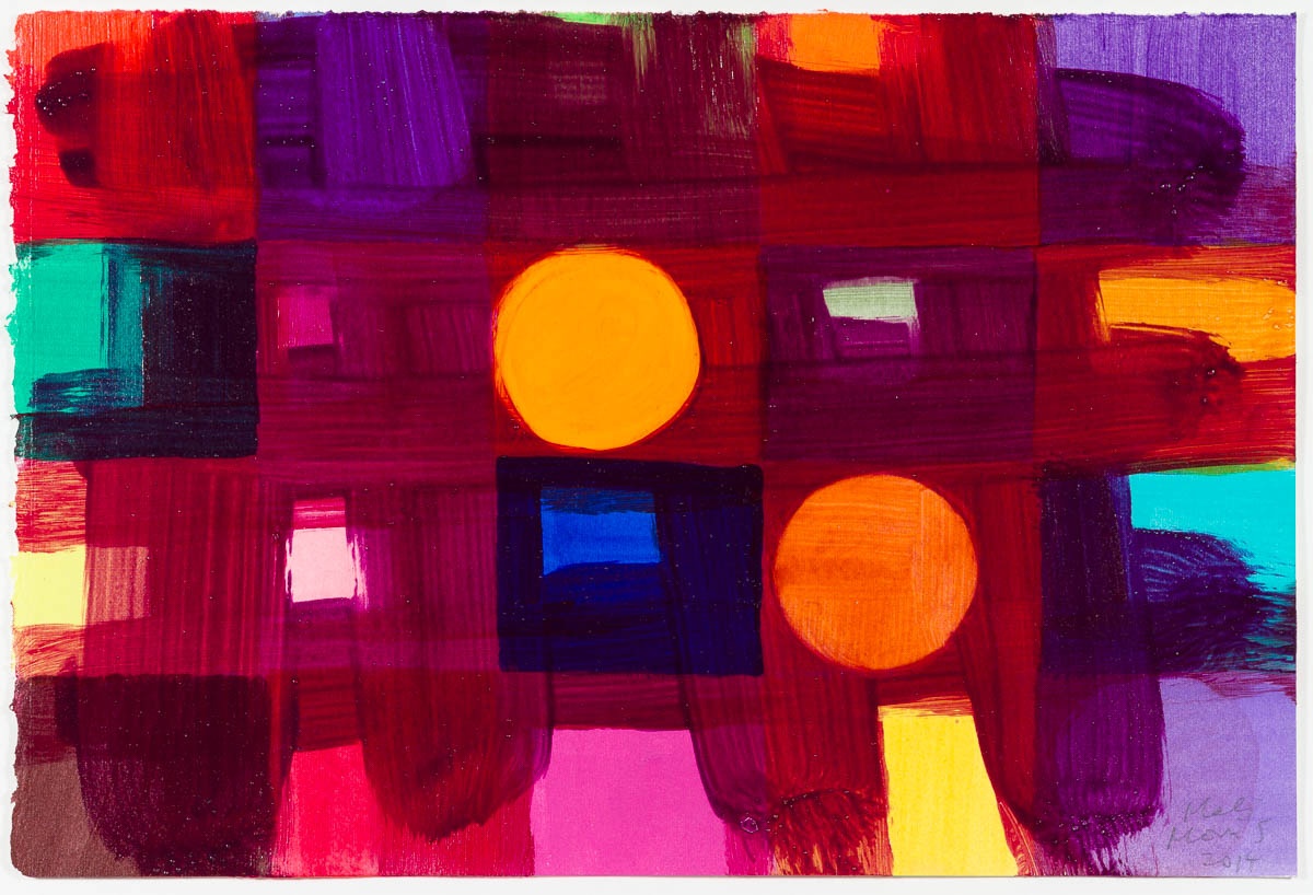
The immediacy of touch, registered long ago, has learnt how to join forces with making and process in the experiment of new art. Colour and sound have been harnessed to it, and depth and perspectival looking are all relevant to it. We can see too the importance of the careful cultural referencing that takes place in all of worthwhile painting culture now. The pleasures of new painting arise not from touch and surface sensation alone – but from the signs of the mind thinking.
Brandon Taylor, 2018